PhynixPC
Brand Identity & Visual Direction
I was commissioned to develop the brand identity and visual direction for PhynixPC, a custom PC company specializing in high-quality gaming and workstation builds.
Founded by a team of former employees of Artesian Builds following its collapse, PhynixPC was created as a fresh start—built on craftsmanship, transparency, and community. The brand needed to communicate resilience, trust, and technical expertise while appealing to both first-time buyers and experienced enthusiasts.
Challenge
The challenge was to create a brand that acknowledged the company’s origins without being defined by them. It needed to convey strength, renewal, and credibility, while standing confidently in a competitive tech space.
Visually, the identity had to balance performance and precision with personality, avoiding overly aggressive or generic gaming aesthetics.
Role
I led the brand development, including logo design, visual identity, typography, and promotional assets.
Process
The concept was built around the symbolism of the phoenix, representing rebirth, resilience, and continuity.
Developed the name PhynixPC, referencing the phoenix rising from the ashes as a direct reflection of the company’s origin story
Explored multiple visual directions for representing the phoenix, ultimately choosing a more literal depiction rather than an abstract or minimal approach
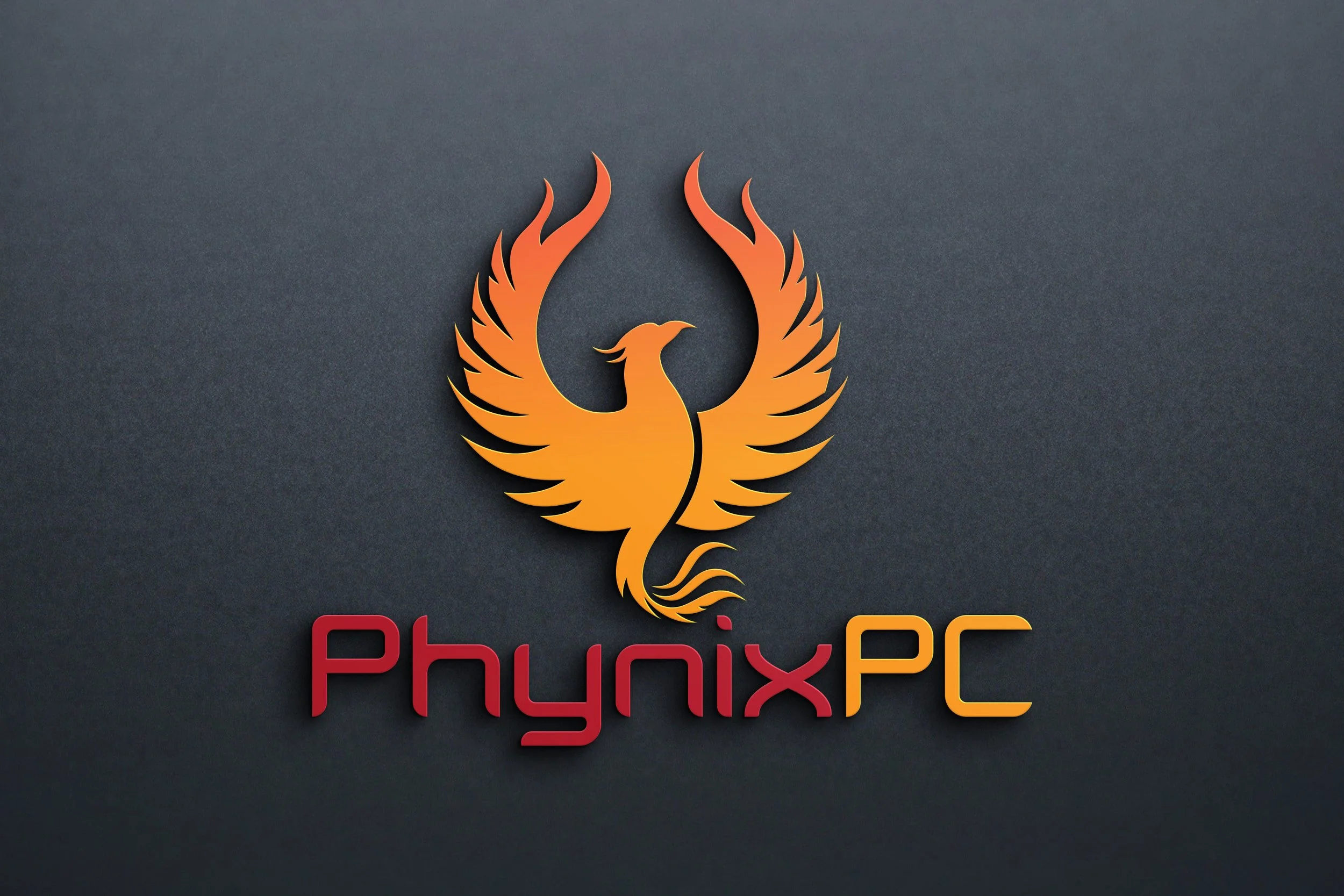
Designed a logo featuring a soaring phoenix, with wing shapes that subtly evoke flames, reinforcing energy, movement, and renewal
Built a color system centered on black, reds, yellows, and oranges, using tonal variation to create depth while referencing fire, power, and endurance
Selected a typographic direction that feels modern and technology-driven, balancing clarity and precision without becoming overly aggressive
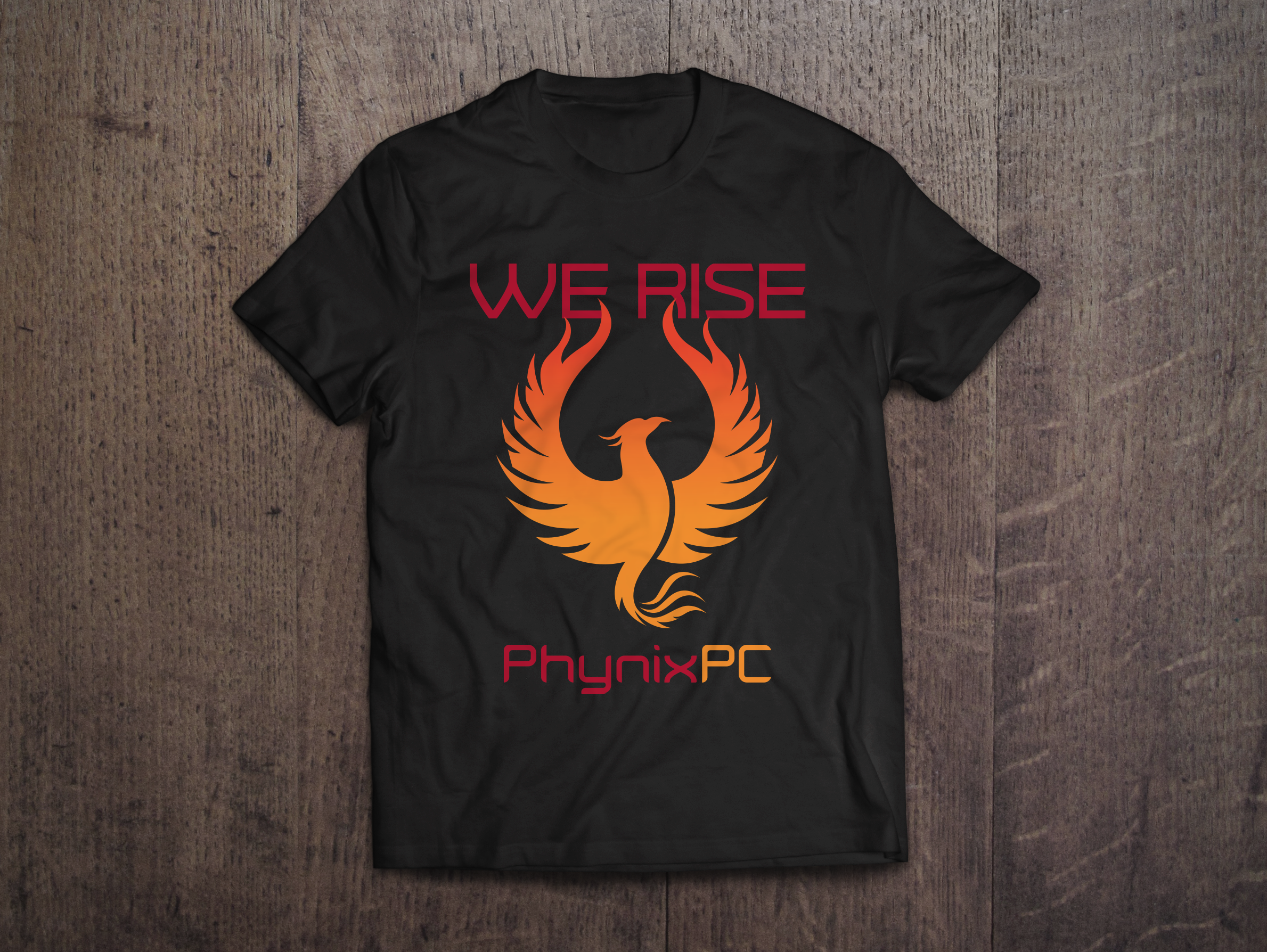
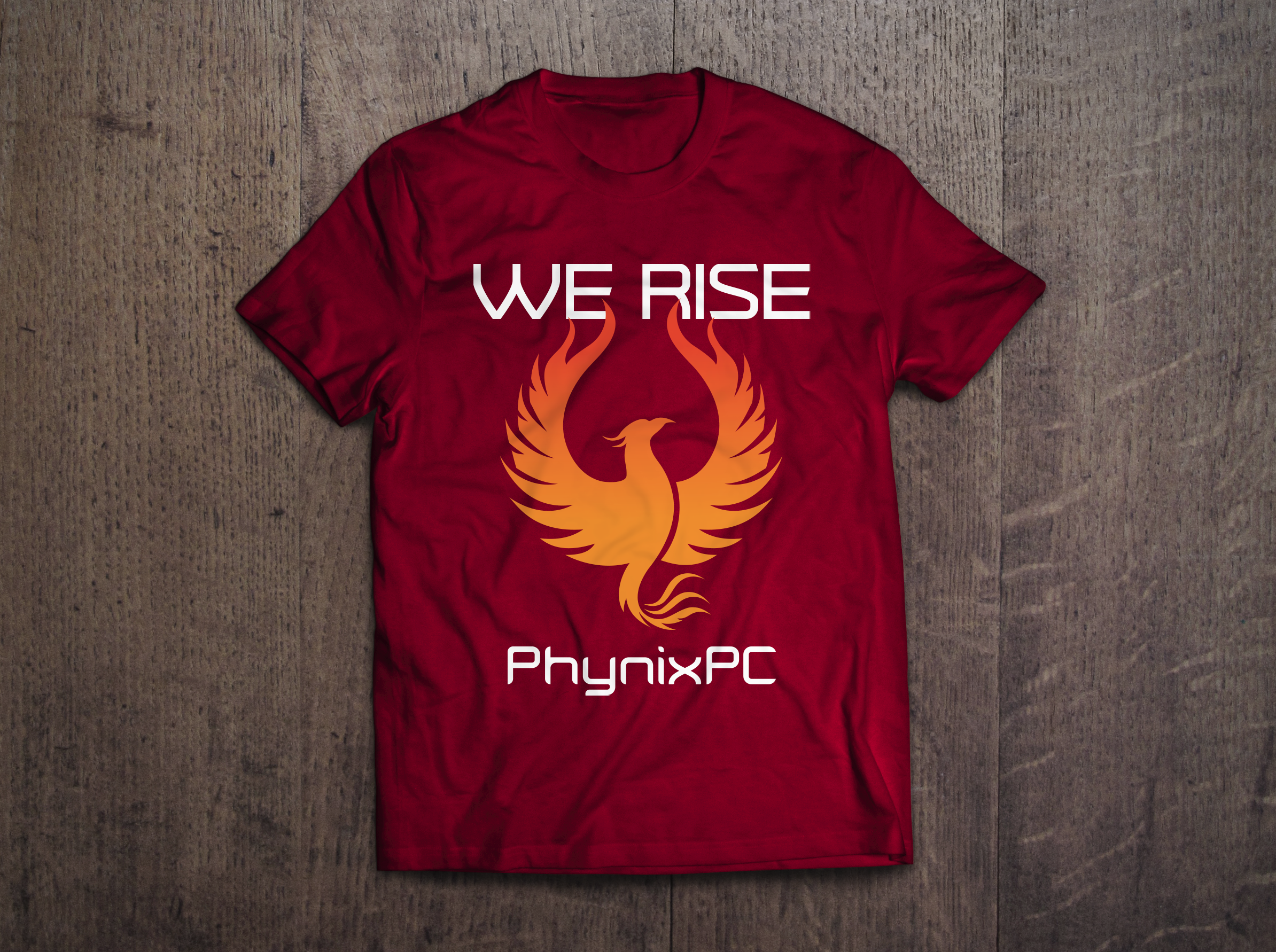
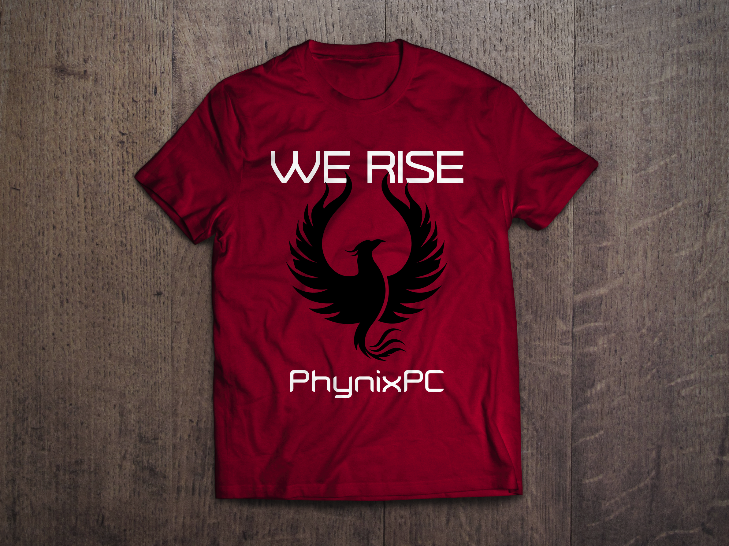
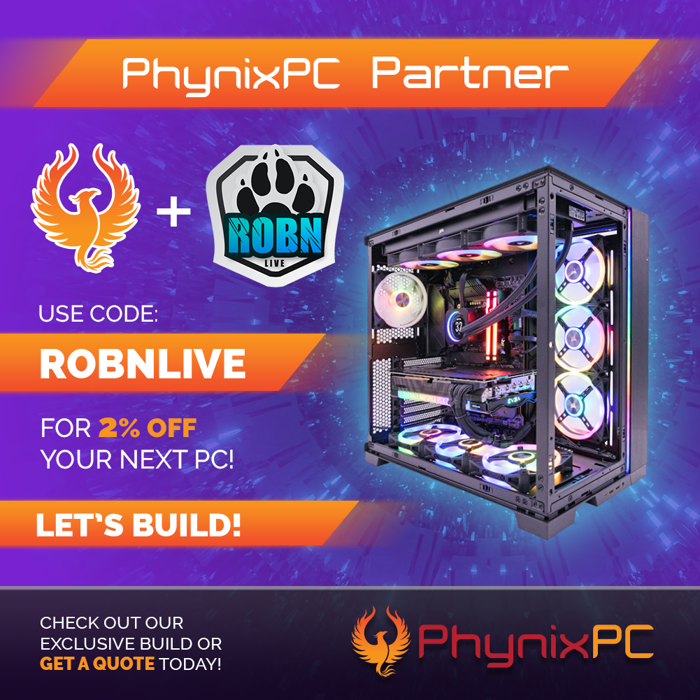
Extended the identity into promotional materials, including discount campaign graphics and branded merchandise such as t-shirts
Solution
The final identity captures the company’s story through a bold yet controlled visual system. The phoenix mark serves as a central symbol of resilience, while the color palette and typography reinforce strength, energy, and technical credibility.
The system is flexible enough to work across digital platforms, marketing materials, and merchandise while maintaining a consistent brand presence.
Outcome
The brand establishes a strong foundation for PhynixPC as a trustworthy and community-driven alternative in the custom PC space. The identity supports both storytelling and scalability, helping position the company for growth while clearly differentiating it from competitors.
This project strengthened my ability to translate a deeply personal brand story into a clear, scalable identity that balances emotion with technical credibility.
Tools
Adobe Illustrator · Adobe Photoshop