Suppe
Brand Identity & Social Media
I was hired to create the full visual identity for Suppe, a Brazil-based soup delivery business founded by a former advertising professional. The name Suppe—“soup” in German—was chosen to honor her late father, evoking the sense of warmth, care, and emotional connection that became central to the brand.
The goal was to build a strong, emotionally resonant identity that could thrive through delivery platforms like Uber Eats and iFood, while offering comfort, nourishment, and a sense of grounding during lockdown.

Challenge
The brand needed to communicate warmth, health, and emotional connection in a fully digital environment. Beyond standing out on crowded delivery apps, the identity had to balance appetite appeal with a deeper message of mindfulness, self-care, and plant-based living.
Role
I led the project end-to-end, including brand identity, logo design, typography, color system, social media content, packaging, and ongoing social media management.
Process
I developed the concept around the idea of food as both nourishment and emotional support, especially during isolation.
Created an organic visual identity to reflect warmth, care, and natural ingredients
Designed a logo and typography system aligned with the brand’s mindful positioning
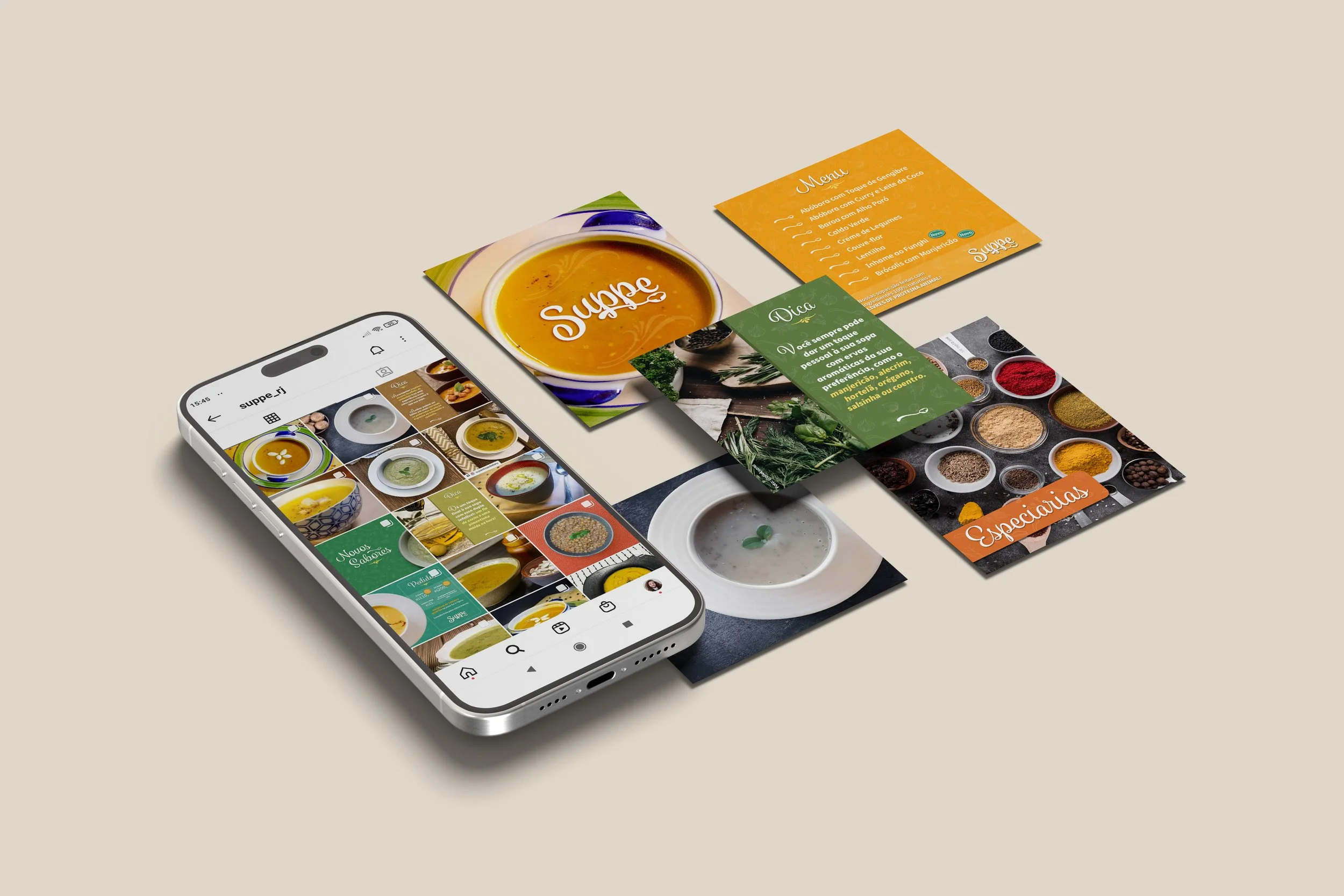
Developed a color palette inspired by the soups and their ingredients, with saffron as the primary logo color—chosen for its association with warmth, nourishment, and its connection to mindfulness and spirituality (referencing the robes of Buddhist monks)
Created ingredient-based illustrations layered over bold color fields
Produced full Instagram content (posts and stories) focused on engagement and consistency
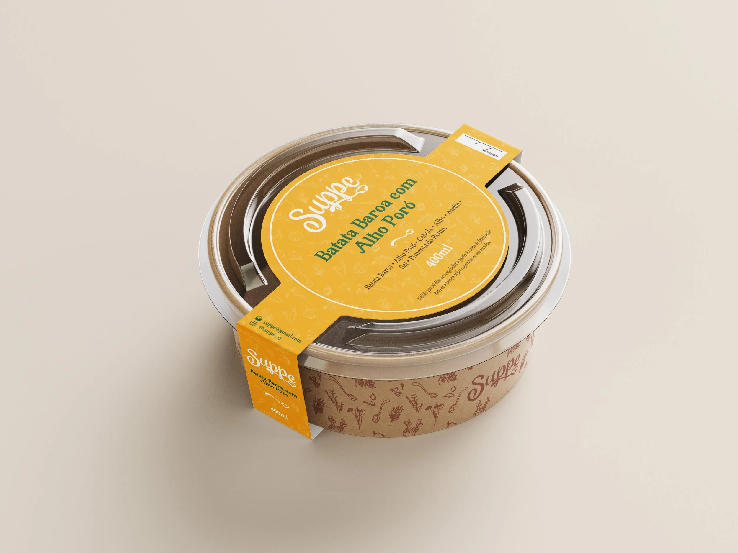
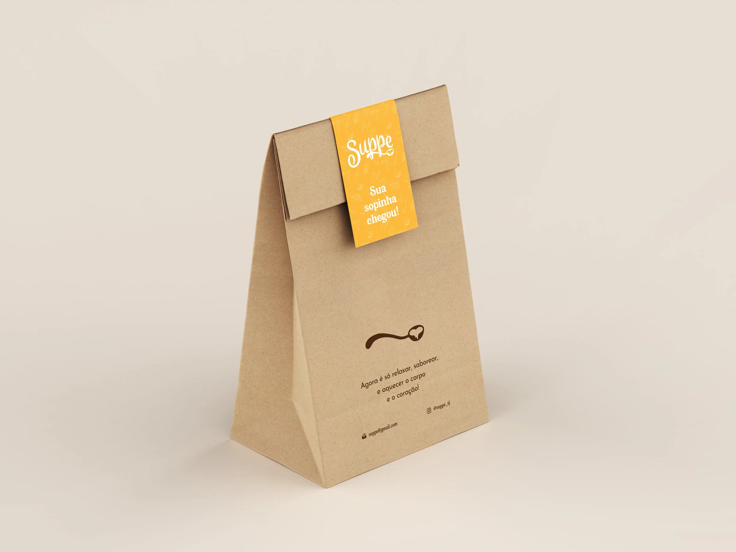
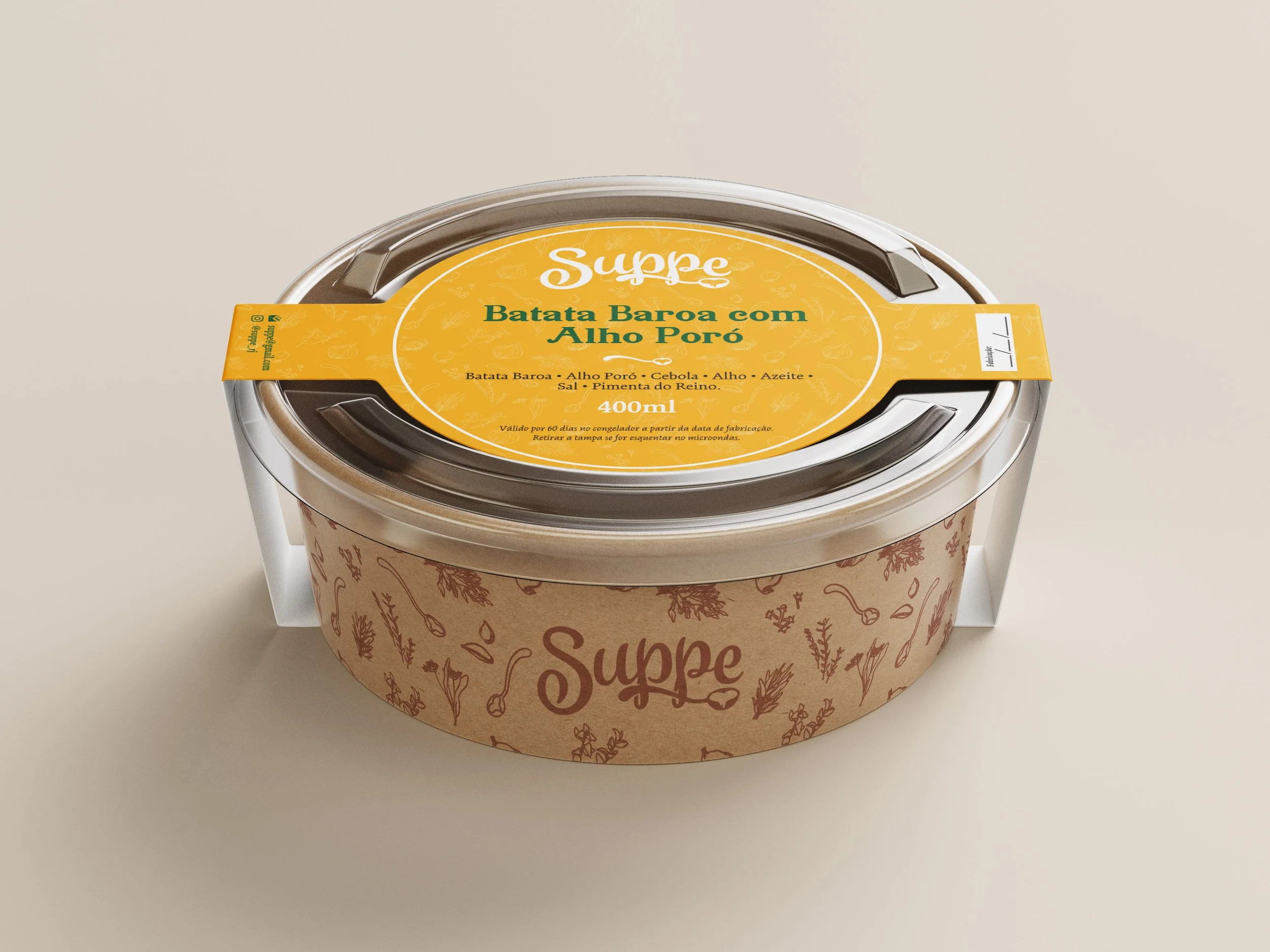
Designed simple, effective packaging and promotional materials for delivery
Edited and treated food photography to enhance texture, color, and appetite appeal
Solution
The final identity combines organic forms, warm tones, and ingredient-driven visuals to create a brand that feels both comforting and intentional. The system translates consistently across social media, delivery platforms, and packaging, reinforcing a cohesive and recognizable presence.
Outcome
The brand successfully connected with customers during the pandemic, building a strong online presence and supporting consistent demand through delivery platforms. Its visual identity helped position the service as both nourishing and emotionally meaningful during a time of uncertainty.
Tools
Adobe Photoshop · Adobe Illustrator · Adobe Lightroom