Kairos Aureum
Brand Identity & Visual Direction
I was commissioned to develop the full brand identity for Kairos Aureum, including logo design, typography, and visual direction.
Kairos Aureum is a founder-led consultancy that helps tech companies and startups scale through global go-to-market strategy, partnerships, and AI/data-driven initiatives. The brand needed to reflect precision, timing, and strategic decision-making—core to helping clients identify and act on the right opportunities.
Challenge
The challenge was to translate abstract concepts such as time, opportunity, and value creation into a visual identity that felt both intellectual and actionable.
The system needed to communicate high-level strategic thinking while remaining clear, modern, and credible within the tech and consulting space.
Role
I led the project end-to-end, including conceptual development, logo design, typography, and color system.
Process
The identity was built around the dual concepts of Kairos—the right or opportune moment—and Aureum, representing gold as a symbol of value, success, and prosperity.
Helped strengthen the name Kairos Aureum to express the idea of acting at the right moment to generate meaningful growth and value
Grounded the concept in the distinction between Kairos (qualitative, strategic timing) and Chronos (linear, measured time)
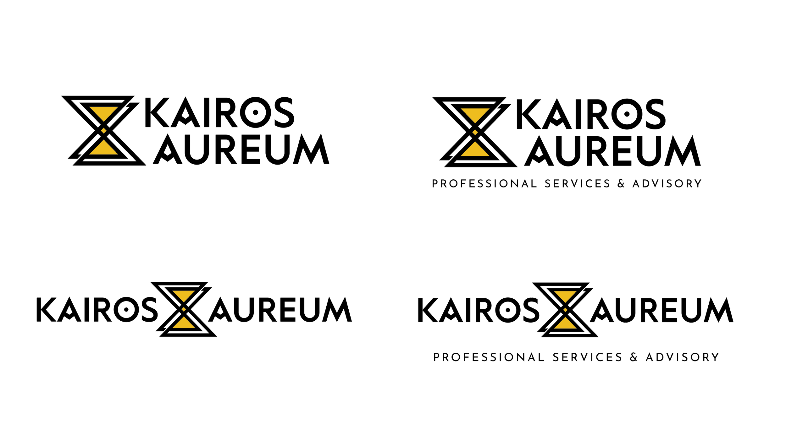
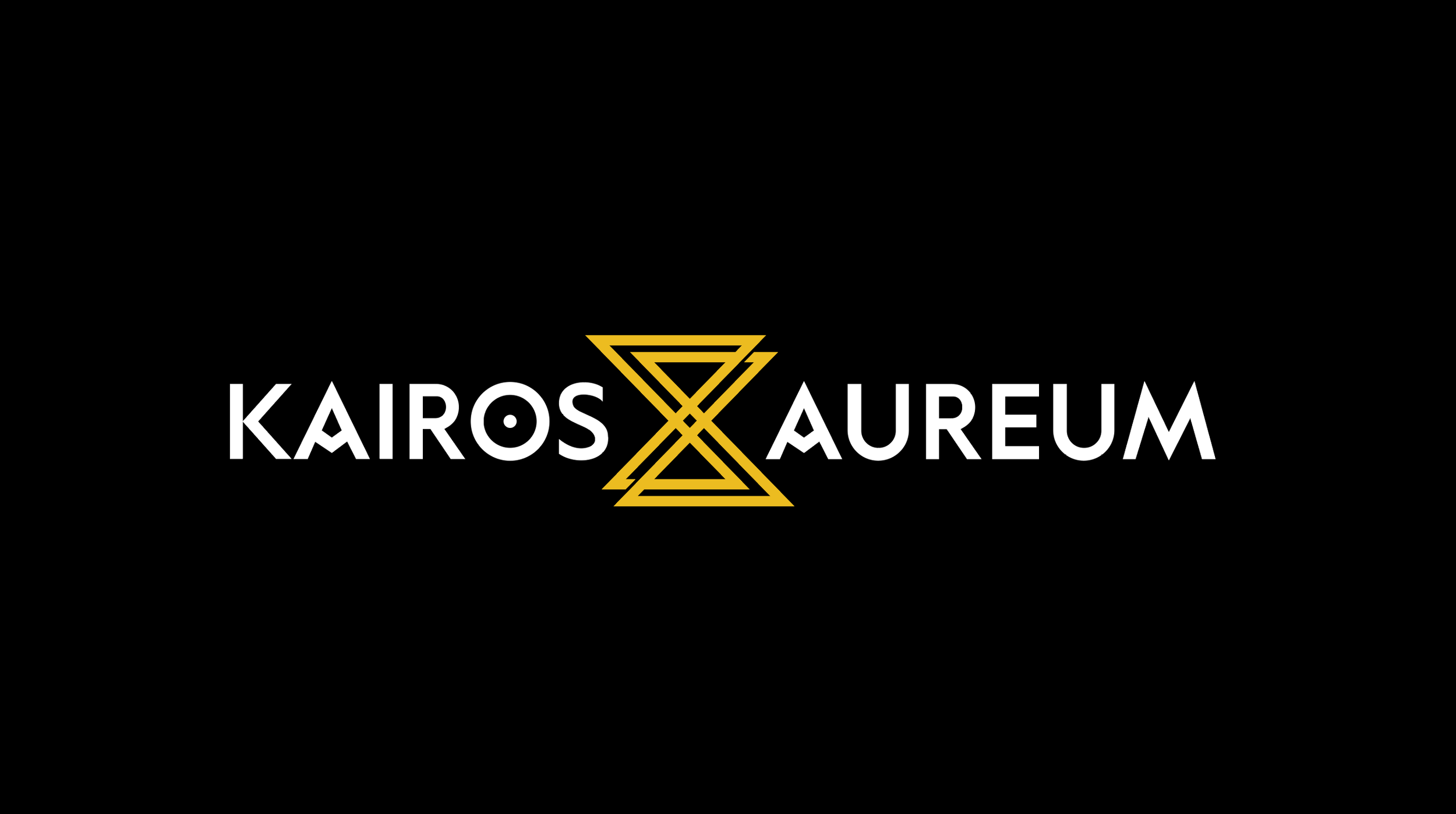
Incorporated symbolism directly tied to the meaning of Kairos, including archery as a metaphor for the precise moment an arrow is released to successfully reach its targetDesigned a custom logotype where each letterform reinforces the concept:
“A” forms function as arrowheads, representing precision and direction
The letter “O” is treated as a target, reinforcing focus and intentionality
The hourglass form serves as an allusion to the letter X (Chi)—referencing the Greek word for with gold (χρυσός)—while also symbolizing the convergence of the right moment between company and client
Selected a sharp, angular typographic style to convey clarity, decisiveness, and strategic precision
Built a color system centered on black and yellow/gold as primary colors, supported by additional tonal variations to create depth and flexibility across applications
Black represents structure, time, and sophistication
Yellow/Gold represents value, illumination, and prosperity
Solution
The final identity merges conceptual depth with a clean, modern execution. Each visual element is intentional, reinforcing the brand’s core idea: recognizing and acting on the right moment to create value.
The system balances symbolism with clarity, resulting in a distinctive identity that communicates both strategic thinking and precision.
Outcome
The brand establishes a strong and differentiated positioning within the consulting space, aligning a concept-driven identity with the company’s focus on growth, partnerships, and data-driven decision-making.
Tools
Adobe Photoshop · Adobe Illustrator